27 July 2026/Terje Ennomäe
New chart types and smarter queries in Feelingstream
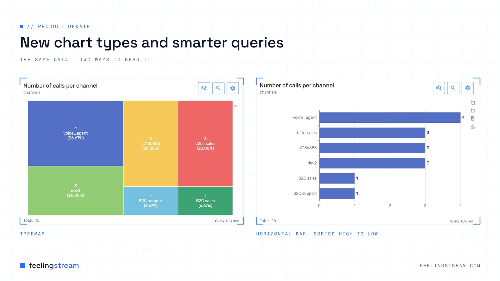
Conversation analytics only pays off when two things are easy: asking the data a precise question, and turning the answer into something a colleague can read and trust. This update improves both. There are three new chart types for hierarchical analysis, clearer and more configurable charts, AI explanations for every visualisation, and a much more forgiving way to write and validate search queries.
Here is what is new and what has changed in a Leadstream version 2.1
See hierarchy at a glance: treemap, sunburst and pivot table
Most conversation data is nested. A call topic has sub-topics; a product line has variants; a region has teams. Until now those breakdowns were awkward to show in a single chart. Three new chart types fix that:
- Treemap — explore hierarchical breakdowns as a compact layout of tiles, where size shows share. Good for seeing which topics dominate at a glance.
- Sunburst — the same hierarchy shown as concentric rings, so you can read the levels from the centre outwards.
- Pivot table — compare row and column aggregations in a matrix, with selectors for the row and column fields. Ideal when the exact figures matter more than the shape.
The chart settings behind these outputs include improved multi-select aggregation controls, a pivot column selector, and clearer validation that tells you when a chart type needs more than one aggregation field before it can render.
Charts that read clearly on their own
A chart that makes sense only to the person who built it does not travel well. Several changes make each chart easier to read out of context:
- Descriptions. Charts now support an optional description of up to 512 characters. It appears on the card, can be expanded when truncated, and is carried along when you import or export a Story.
- Bar chart options. Choose horizontal or vertical orientation, and sort high-to-low or low-to-high — with the Other bucket always kept last so it never distorts the ranking.
- Data labels. Many chart types now support Show values, with sensible positioning per type (above or inside for bar, line and area charts; outside or inside for pie, sunburst and treemap). Stacked bars label each segment when there is room, and fall back to the stack total when there is not.
- A clearer treemap. Larger tile labels, hierarchy headers that show share percentages, and better resize behaviour when the chart sits on a Story.
- Inline guidance. Advanced settings rows now carry short info tooltips explaining what each option does.
A cleaner Story layout, and exports that explain themselves
The cards on a Story use a refreshed layout: title and description on the left, actions on the right, and the chart below. The AI explanation panel now opens beneath a card without being clipped by its neighbours.
Chart downloads improve too. When you save a chart as a PNG, the image now includes the card title, description and the active date period above the chart — so a visualisation dropped into a slide or an email still makes sense to someone who was not in the tool when you made it.
AI explanations for every chart type
The chart explainer now works across the board — bar, line, area, pie, sunburst, treemap, pivot table, big number and data table. Explanations draw on the chart's title and description along with richer context, including comparison periods, the aggregation mode and sample values, so the written summary matches what the chart actually shows. The styling has been aligned with the updated card layout.
Easier, more reliable query writing
Precise questions need precise queries, and writing them should not feel like defusing a bomb. Query editing is significantly improved in both Search and chart settings:
- Live syntax feedback with clear, position-aware error messages, so you see where a query is wrong as you type.
- Format query to tidy up your syntax in one click.
- An expandable, resizable query editor inside chart settings.
- Similar words suggestions — click a word in the editor to find related phrasings, so you capture a whole topic rather than a single wording.
- An Add field action to insert field syntax at the cursor.
The How to write queries help has been fully rewritten with a sidebar layout covering simple samples, a syntax reference, search fields, complex examples, production patterns and sales-focused examples — each with a Copy button. A new Search fields reference is available from Search and from the help modal, listing field descriptions and query examples, with your role-based field access respected.
Chart settings: faster and clearer
Editing a chart's query, title and description should feel smooth. The preview no longer reloads on every keystroke; validation runs when you save; and the save button shows Unsaved changes while you have pending edits. Alongside that:
- Advanced settings are hidden when they do not apply to the current chart.
- On/off toggles for the trend line, comparable period and centred average.
- Inline hints when an output-type combination is not recommended.
- A clearer message when a title is required before you can save.
Reliability and preserved behaviour
This release also fixes Story layout display issues, pie chart value labels when Show values is off, and chart image downloads that were missing the title and description. Call-event audio deletion has been hardened for more reliable error handling.
Your existing charts are preserved. Bar charts default to vertical orientation and high-to-low sort, and pie charts that previously showed outside labels continue to behave exactly as before — so nothing you have already built needs rebuilding.
Frequently asked questions
Which chart should I use for hierarchical data?
A treemap or a sunburst. Both show nested breakdowns — topics and sub-topics, products and variants — in a single view. Reach for a treemap when you want to compare share by area, and a sunburst when you want to read the levels from the centre outwards. Use a pivot table when the precise row-by-column figures matter more than the visual shape.
Do I need to rebuild my existing charts and Stories?
No. Existing charts are preserved and keep their previous behaviour, including bar orientation, sort order and pie label placement. The new options are opt-in.
How can a colleague understand a chart I share?
Add a description (up to 512 characters), which travels with the chart when you export a Story and now appears on downloaded images. Every chart type also has an AI explanation, so the written summary stays in step with what the chart shows.
What if my search query has an error?
The editor gives live, position-aware feedback as you type, and Format query tidies your syntax. The rewritten query help and the new search fields reference give worked examples you can copy.
Where to go next
- The pillar guide: What is conversation analytics?
- Choosing the right view: Visualising conversation data
- Share the finding: Building shareable Stories
- Find the moment: Search across conversations
- The engine behind the data: Multilingual speech-to-text
Want to see these charts and query tools on your own conversations? Book a demo and we will explore your data with you.