Interpreting customer feedback beyond the NPS score can be a trickier task than you might think. Imagine this. You have composed a clever questionnaire with carefully worded questions. It presents tested categories for ranking between best to worst or fastest to slowest. You have added a box for free form comments that you dread to analyse. The difficult part is now done – all answers can be structured and analysed in bulk. If the response ratio is good, you’re golden. Or are you?
People see the NPS score scale very differently
Would you recommend our service?
How likely you are to recommend our service?
These are simple questions that companies ask who use NPS (Net Promoter Score) methods to get customer feedback. Looks pretty straightforward – the customers pick the numbers and you will know what they think of you. We have found that this path is more treacherous than it seems.
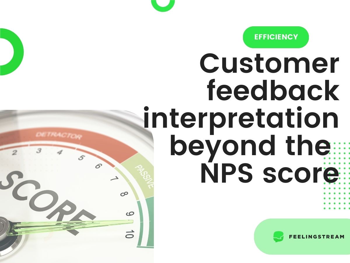
People see the scale of 0 to 10 very differently. We in Feelingstream have seen it by analysing the free text comments together with the given NPS score. Thus, we can test how well the score reflects customers’ opinions of you and what actually lies behind the numbers. In fact, people’s perception of these numbers varies a lot.
We compared the NPS number with the sentiment in the comment – whether it’s positive, negative or neutral. It’s not very radical to assume that people who write positive comments are the promoters – the ones who recommend. In turn, people writing negative comments – the detractors – think very little about your service and openly bash you in their circles.
Customer feedback reality – the NPS score and comments about your brand don’t always match
It turns out that the scores people give don’t always match what they write about you in their comments. We compared the calculated NPS based on numerical scores. The ratio of people giving 9 or 10 minus ratio of people giving scores 0-6 in comparison to the ratio of people giving positive comments minus ratio of people giving negative comments.
We found that in some industry sectors, NPS calculated using traditional numerical scores can be significantly lower than NPS calculated using text analysis. It shows that people are consistently more conservative when they are asked to score compared to what they write in their comments. This discrepancy is not universal, in some industry sectors text analytics NPS and numerical score NPS match perfectly. However, analysing only numbers does not give you the full picture and as we have seen – sometimes it gives you a skewed picture instead.
Analysing text from your customers gives you more information about them. You can catch those who give high scores but share negative comments. They are the ones who are on the verge of crossing over to the not recommending party, or even worse, to the competitor.
If you want to read more about efficiency, check out our Ultimate Guide to Efficiency with AI!


